The Earthy Casita:
Editing a gray rental into something people actually remember
Builder-Grade Bland, But Full of Potential
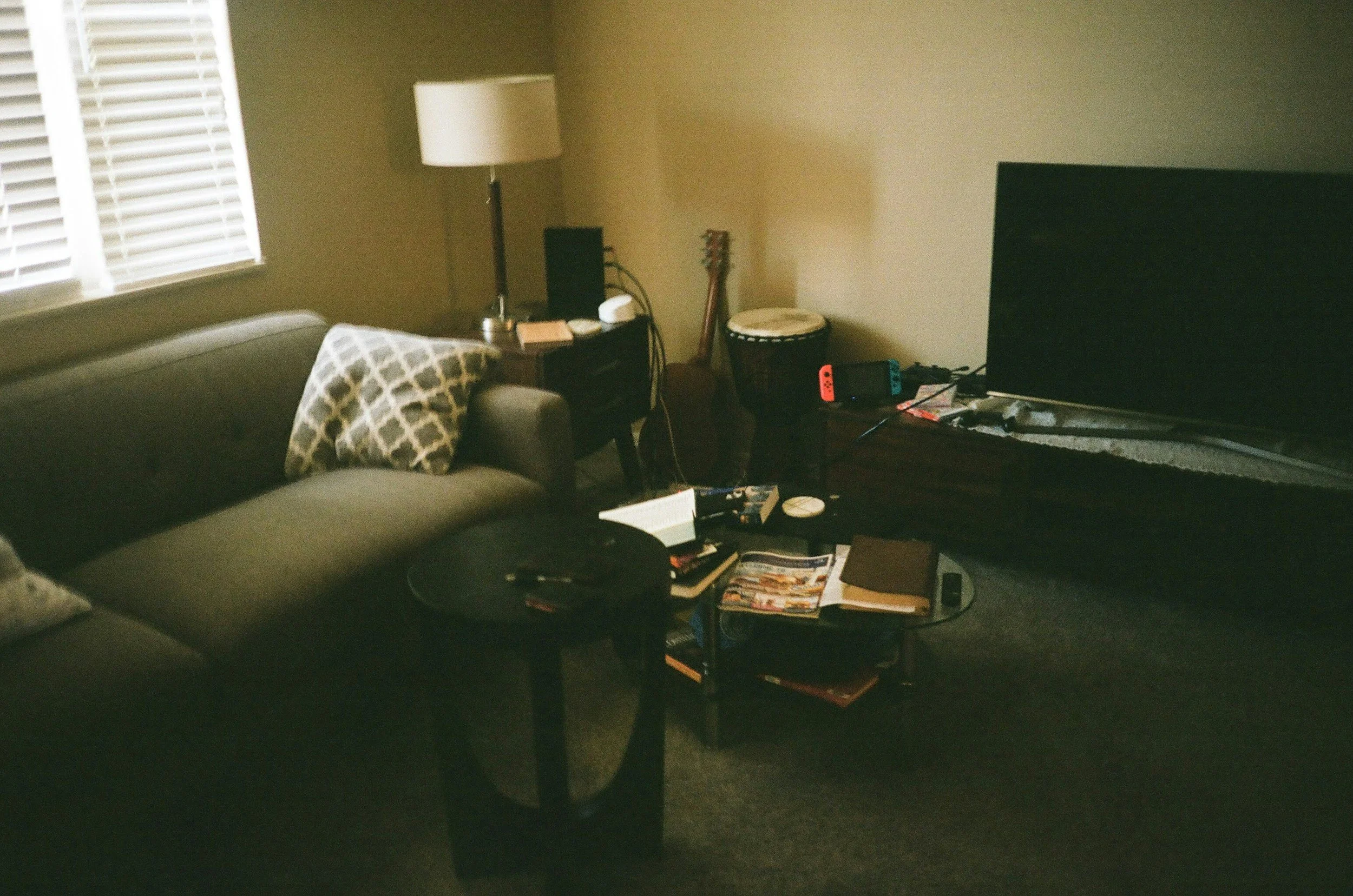
This project started the way most rentals do. Builder-grade finishes. Gray walls everywhere. A layout that technically worked but felt mildly annoying to live with.
Nothing was wrong enough to complain about.
Nothing was strong enough to stand out either.

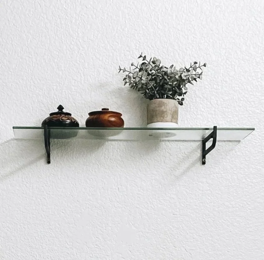
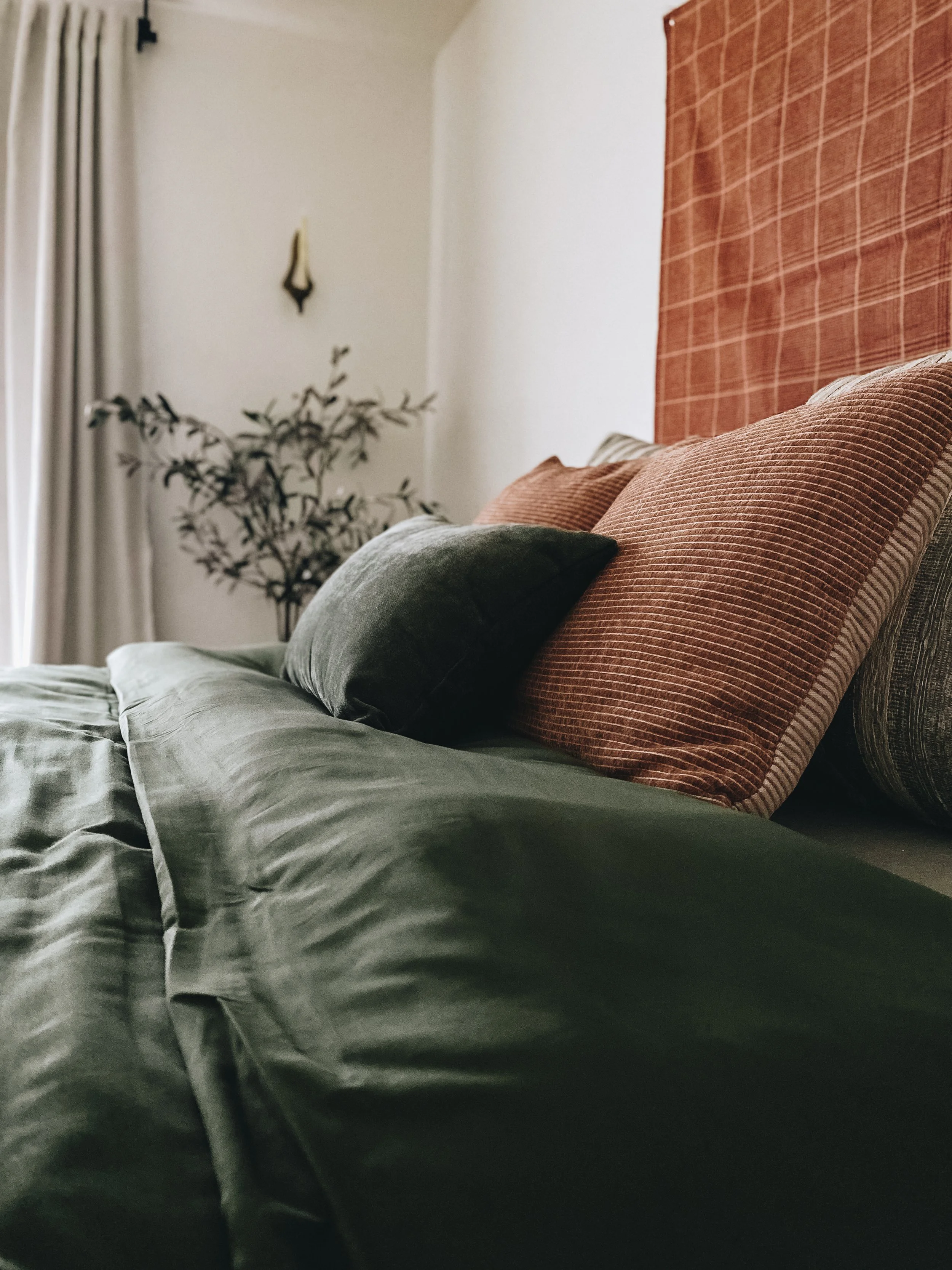
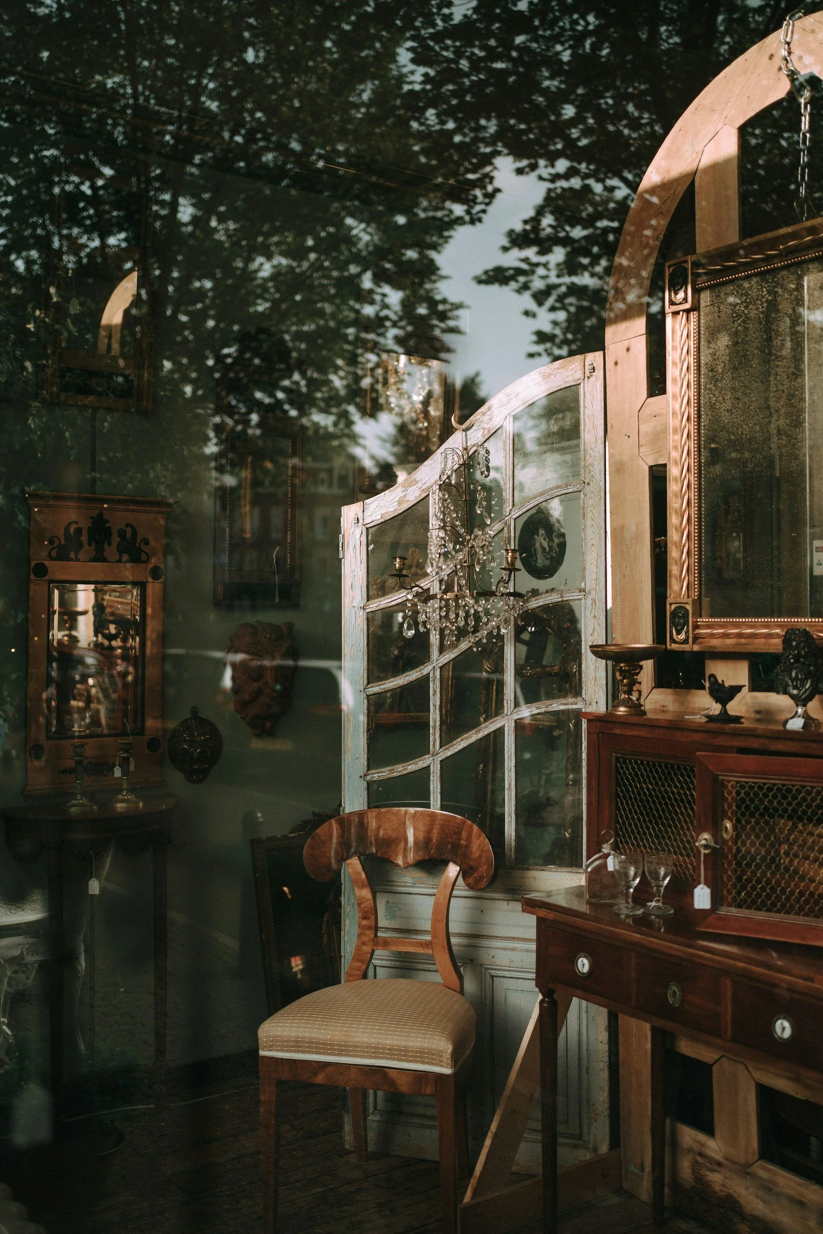
The owners weren’t looking for a trendy overhaul. They wanted warmth and a lived-in Spanish influence. Terracotta. Olive. Texture. And they were clear they didn’t want to overspend or regret a bunch of decisions a year later.
So we didn’t fix this by adding more. We fixed it by editing.
Edit first. Add only what earns its place.
We didn't solve this by piling on more stuff. Instead, we got ruthless about editing. First, we audited what was working versus what was dragging the space down. The palette was the silent killer, too vague, so we sharpened it to make every choice reinforce the next. No more guessing.
We kept what fit the flow and ditched what fought it.

Builder-grade didn’t automatically mean bad. Pieces only got swapped if the scale was wrong or the circulation suffered. In a one-bedroom rental, those mistakes show up fast, even if you can’t name them.
A lot of the budget went toward restraint. Thrifted and vintage pieces carried more weight than new ones. Texture mattered more than trends. Materials were chosen for how they handled light during the day and how they felt at night, not how they photographed once.
We kept what fit the flow and replaced what fought it.
Every decision came back to the same question:
Does this make living here easier, or is it just filling space?
From Forgettable Neutrality to Intentional Flow
Stuck with a rental that feels flat and forgettable? We sharpened the palette and flow through targeted edits, so the space gains a grounded, memorable point of view that draws bookings.
Before we came in, the home played defense. Gray everywhere. An awkward flow. The kind of neutrality that disappears from memory the minute you leave. So, we audited for clarity, keeping what worked and refining scale and circulation with thrifted textures that honored the light and real-life use. Now, the space had a point of view. Warm terracotta and olive grounded the rooms. Fewer pieces, better chosen. A layout that finally made sense when you were actually moving through it, not just looking at photos.

Mindset Over Makeover

The transformation went deeper than visuals. The owners thought neutral was the low-risk play for a rental. But they quickly realized that safe often equals forgettable in a crowded market.
Now? Steady bookings. Guests rave about the "intentional comfort" and home-like feel. The home owners quit second-guessing because the space has logic, it's an asset, not an afterthought.
Why This Matters for Your Project
This is how I work. I don’t layer trends or force ideas into spaces that can’t support them. I edit reality until a home feels grounded, logical, and easy to live in. Budgets go further when decisions are clear and unnecessary choices are removed.
If you want a space that’s considered instead of cookie-cutter, let’s work together.