Choosing Kitchen Paint Without Repainting It Twice
The color looked right in the store.
It looked right on the swatch taped to the wall. It looked right at 10am on a Saturday when the light was coming in from the east and you had coffee and optimism in roughly equal measure.
By dinner it was a different color entirely. Not wrong exactly. Just not what you chose. Not what you saw. Something flatter. Cooler. Slightly off in a way you could not name but could absolutely feel every time you stood at the counter.
You repainted.
I want to save you that Saturday.
Not because paint is precious or repainting is catastrophic. Because the reason this keeps happening has nothing to do with your taste and everything to do with your kitchen's relationship to the sun. And once you understand that relationship, the decision stops being a gamble and starts being obvious.
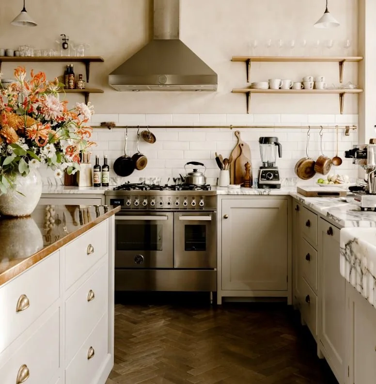
Image | House and Garden
The color didn't change. The light did.
This is the thing nobody explains before you commit.
Paint does not have a fixed appearance. It has a range of appearances determined by the quality, direction, and temperature of the light hitting it at any given moment. The same paint chip reads differently at 7am, 2pm, and 6pm. It reads differently in January than in July. It reads differently under your overhead fixture than it does in natural light. The swatch you fell in love with was showing you one data point from a much larger set.
Research on color perception and psychological response has established that color in interior design is not a fixed property of the surface. It is a relationship between the surface, the light source, and the observer. Change any one of those three variables and you have a different color. You change all three over the course of a single day.
Your kitchen changes all three over the course of a single day.
This is not a design problem. It is a physics problem. And the fix is not a better swatch. It is understanding what your kitchen's light is doing before you commit to anything that has to live inside it.

Image | House and Garden
What your kitchen's orientation is actually doing
The direction your kitchen faces determines the quality of light it receives. Not the quantity. The quality. The color temperature, the softness or hardness of the light, and how dramatically it shifts throughout the day. These are the variables that determine whether a color settles or fights with itself depending on the hour.
North-facing kitchens receive indirect light all day. No direct sun. The light is cool-toned, soft, and relatively consistent, which sounds appealing until you realize it means colors read more muted and slightly blue throughout the day. Stark whites turn clinical. Cool grays go flat. Warm, light-reflecting tones do the opposite of what you expect and feel more generous rather than more overwhelming.
If your kitchen faces north: creamy whites, soft buttery tones, warm beiges. They will not look as warm as you fear. They will look like exactly what the room needs.

Image | Pinterest
South-facing kitchens get the most direct, consistent light. Colors read closer to their true swatch value. The room can handle what north-facing rooms cannot. Deep greens, navy, warm terracotta, colors that would feel oppressive without strong light find their best version here. If you have been wanting to do something bold and your kitchen faces south, this is the permission.

Image | House and Garden
East-facing kitchens glow in the morning and cool significantly by afternoon. The same room that felt warm and golden at breakfast feels shadowed and cooler by 3pm. This is the kitchen that needs a color that holds across both registers. Greige, the particularly useful middle ground between gray and beige, was practically invented for east-facing rooms. It adapts. It does not read as either warm or cool. It simply belongs, regardless of what the light is doing.
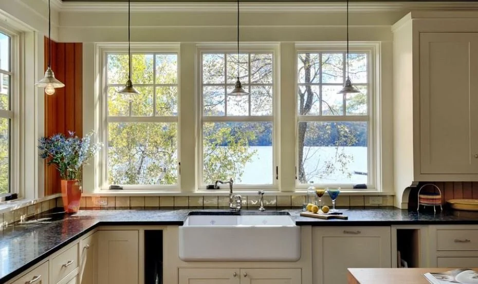
Image | Architecture Ideas
West-facing kitchens have the opposite problem. The morning is flat and the afternoon is fiery. Warm orange-red tones flood in late in the day, which means any color with warmth in it will read as very warm by dinner. Cooler tones, soft blues, sage greens, pale grays, do not fight the afternoon light. They balance it. Avoid anything that is already warm. By 6pm it will be working twice as hard as you intended.
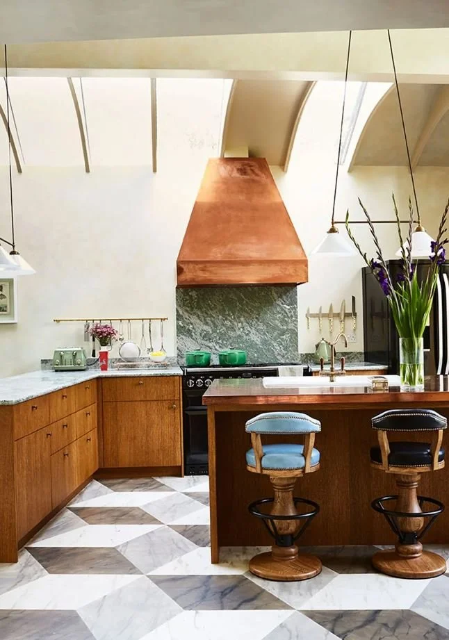
Image | House and Garden
The design rule that has been misleading you
There is a piece of advice that circulates constantly in interior design and is not supported by the evidence it claims to rest on.
Light colors make rooms feel bigger.
A residential architect reviewing over a century of psychological studies on color perception and spatial perception found that observers consistently perceive bright objects as nearer, not farther. The research does not support the idea that light walls create the perception of more space. The rule exists because it is easy to repeat and it gives people permission to play it safe.
Playing it safe in a south-facing kitchen that can carry a deep color is a waste. Playing it safe in a north-facing kitchen with warm tones is the right call, but for the right reasons, not because someone told you light colors make rooms feel larger.
Make the decision based on your specific orientation and your specific light. Not on a rule that was never as reliable as it sounds.
What about artificial light
Your overhead fixtures are not neutral. The bulb temperature you have installed is shifting every color in the room in a direction you may not have accounted for.
Bulbs below 3000K cast warm yellow light. They make warm tones warmer and cool tones muddier. Bulbs above 4000K cast cool blue-white light. They make cool colors crisper and warm colors look washed out. The color rendering index, the CRI, tells you how accurately the bulb shows true color. A CRI of 90 or above means the paint reads closest to what it actually is. Below 80 and you are making design decisions based on a color that does not quite exist in natural light.
If you are choosing paint for a kitchen you will primarily use in the evening, test your swatch under the actual bulbs you are using. Not in the daylight. Not in a showroom. In your kitchen, at night, with the lights you have.
This is the test most people skip. It is the one that would have saved the Saturday.
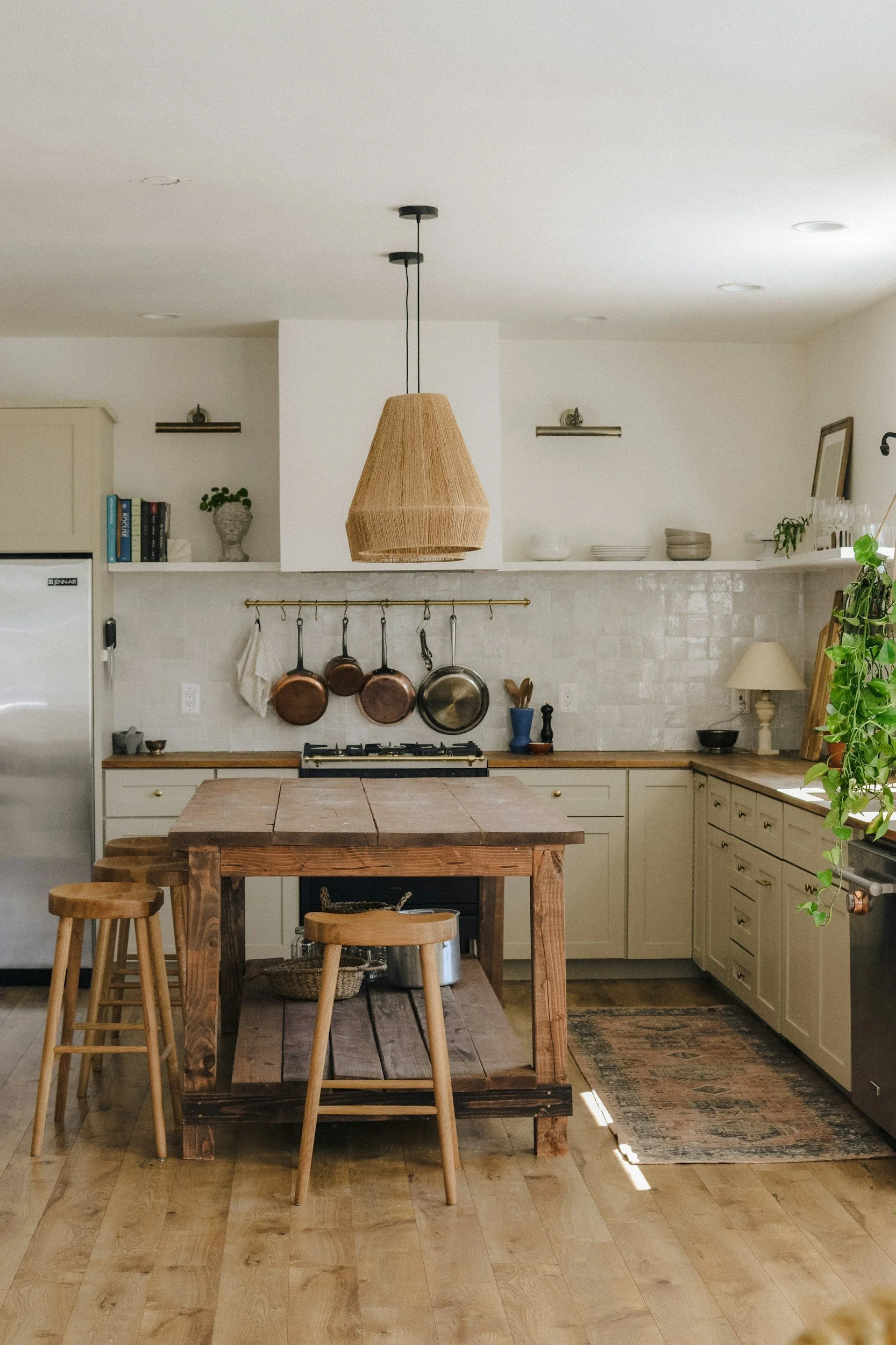
Image | SosyInteriors
The decision that does not reopen
Here is the order that produces a color you will not repaint.
Identify your orientation. Stand in your kitchen and find out which direction the primary windows face. North, south, east, west. This is not optional information. It is the starting point.
Get large samples. Not the small chips. Large peel-and-stick swatches or a quarter pot applied to at least a twelve-inch square on the actual wall. Not on white card. On the wall.
Live with them for three days. Not three hours. Watch what the morning does. Watch what the afternoon does. Watch what the evening does under your actual bulbs. The color that still feels right on day three at 7pm under your kitchen lights is the color.
Everything else is a guess wearing the clothes of a decision.
The color decision that holds is almost never the one made fastest. It is the one made with the most information about the specific room it has to live in. Your kitchen's orientation is that information. It was always available. Nobody told you it was the first thing to know.
If you have been standing in front of paint chips for longer than this decision should take, it is almost never about the chips. It is about not having a clear enough picture of what the room needs before the options multiply.
That is a two-hour conversation and it starts with the room, not the colors.