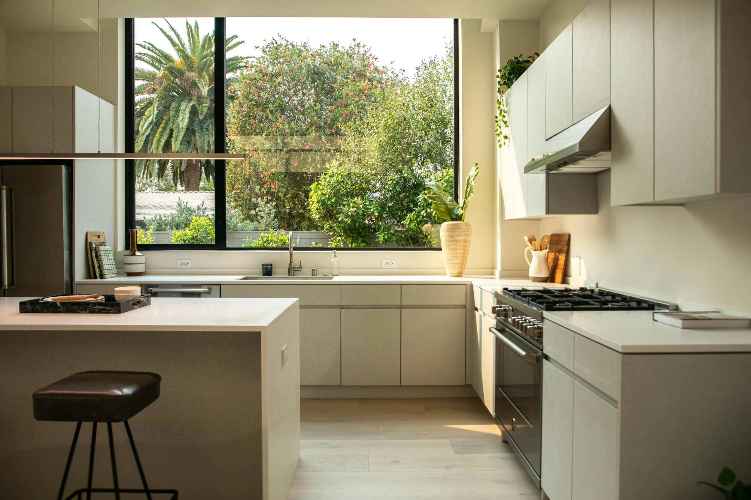
Not Another White Kitchen: 5 Cabinet Colors That Feel Timeless (Not Trendy)
You stand in your kitchen, coffee in hand, staring at the cabinets.
The white ones you once thought were the “safe choice.”
But now?
They just feel cold. Like they belong in a showroom or 2010—not in your lived-in, evolving home.
You’ve pinned hundreds of inspiration photos. Swiped through more color swatches than you care to admit. Debated warm greige vs. soft taupe until the names all blurred into paint company jargon.
And still… nothing’s giving you the feeling you want.
So the cabinets stay untouched.
Not because you’re indecisive.
Because every choice feels loaded.
What if it’s wrong? What if it dates fast? What if it makes the kitchen feel even less like “you”?
Sound familiar? Let’s fix that.
Let’s walk through cabinet colors that still feel safe-adjacent—but have enough personality to move you past "default white."
For the person who’s ready to evolve… but not interested in a full design leap just yet.
Why Your Cabinet Color Shouldn’t Change With the Trends
(And Why That’s a Good Thing)
Let’s be honest:
Every year, a new “it” color shows up in your feed.
Designers declare it’s the shade you need to stay current.
One year it’s all-white.
Next, it’s moody blue.
Now? Earth tones are “having a moment.”
It’s enough to make anyone feel like they’re constantly behind.
Or worse—like no choice will ever be right for more than a season.
But the reality is: Your home isn’t meant to keep up.
It’s meant to hold up—to reflect the life you’re actually living, not the one trends say you should have.
That’s why my approach is different.
We don’t choose color for what’s trending. We choose it for what is true for you.
Imagine this: It’s a quiet morning.
Sunlight’s streaming in.
You step into your kitchen—and instead of second-guessing, you exhale.
The color?
It doesn’t shout for attention.
It doesn’t feel tired or overdone.
It just feels right.
It’s the backdrop to the moments that matter:
Coffee brewing while the house wakes up.
Pancakes on a slow Sunday.
A glass of wine after a long day.
This isn’t about picking a color that looks good for a year.
It’s about choosing a tone that holds meaning, warmth, and you.
And that’s the kind of decision that lasts.
Why Paint Colors Change the Second You Get Home (And What To Do About It)
If you’ve ever fallen for a paint chip in the store only to get it home and think...
“Why does this look green now?!”
...you’ve met the lighting overwhelm.
Light. Changes. Everything.
And that’s why no online inspo pic (or even a sample at the paint store) can predict how a color will actually behave in your kitchen.
Quick tip: Always date your paint before you marry it
Samplize peel-and-stick samples are my go-to (no, they’re not sponsoring me — I just believe in them like I believe in a good cup of coffee).
Stick them to your cabinets.
Look at them in the morning, afternoon, and evening.
Notice how they shift.
(Pro tip: Order one shade lighter and one shade darker than you think you want. Trust me on this.) And If you’re picking colors without a vision, read this first.
Let’s Talk About Your Inspiration (Not Pinterest’s Algorithm)
By now, you’ve probably collected way too many dreamy kitchen pins.
Modern, cozy, rustic, airy.
Your boards are overflowing.
Your head? Still undecided.
That’s not a failure.
That’s what happens when we gather other people’s ideas before we ask ourselves what we actually want.
So instead of falling down the Pinterest rabbit hole (and ending up right back in “maybe this?” mode), let’s approach inspiration differently.
Here’s the move:
Create one private board. Title it something simple like: “Kitchen That I Love to Cook In”
Then pin only the spaces that stop you in your scroll.
Not what looks cool. Not what’s trending.
Just what makes your chest soften. Your jaw unclench. Your gut whisper, yes.
This board isn’t for duplication.
It’s for reflection.
By the time you’ve gathered enough, you’ll stop seeing “styles” and start seeing patterns:
Warm wood textures keep showing up.
Soft greens and muted stone feel calm.
Every photo has open shelves or brass hardware.
That’s not coincidence.
That’s you collecting what you love.
Image | Unsplash
The “Finish” That Makes or Breaks Your Cabinet Color
Here’s the part everyone skips until it’s too late:
Sheen matters.
A lot.
It’s not just about whether your cabinets look glossy or matte.
It’s about durability, mood, and how forgiving your finish will be when life gets messy (because life will get messy).
Here’s the short version:
Flat / Matte: Beautiful for walls, terrible for cabinets. Scratches + stains galore.
Satin: The sweet spot. Durable, easy to clean, subtle glow. My default recommendation for most homes.
Eggshell: Tempting, but not tough enough for kitchen life.
Semi-gloss: Ultra durable, reflects more light. Great for busy households or serious cooks.
If in doubt, choose satin.
There’s a reason it’s the industry favorite.
This Isn’t Just Picking a Color—It’s Picking a Feeling
That’s the real decision here.
You’re not just choosing what looks “nice.”
You’re choosing what makes your kitchen feel like it can hold your everyday life:
Mornings where you’re running late.
Afternoons filled with snacks and homework.
Evenings when the light hits just right and you realize: I love this kitchen!
That’s the point.
Your Not-Too-Safe, Just-Right Color Lineup
Image | Studio McGuee
Creamy White OC-7 | Benjamin Moore
The gentle neutral that doesn’t try too hard
If you still love the idea of white cabinets but not the sterile showroom look, this is your lane. Creamy White is soft without being beige, warm without feeling yellow, and versatile enough to work with whatever else your life brings into the kitchen (toddlers, wine spills, trends that come and go).
Why it works:
✔ Feels inviting, not clinical
✔ Pairs with everything from butcher block to quartz
✔ Adds warmth without overpowering the room
Test it in your actual light before deciding. This one loves a sunny morning.
Image | Centsationalstyle
Pashmina AF-100 | Benjamin Moore
If “cozy sophistication” was a color
A taupe-gray that somehow feels like your favorite cashmere sweater — calm, textured, and timeless. Pashmina brings enough depth to anchor a space but stays flexible depending on the light.
Why it works:
✔ Adds richness without making the space feel heavy
✔ Elevates modern or classic kitchens alike
✔ The color equivalent of exhaling after a long day
This one tends to surprise people in the best way. Definitely a “try before you commit” shade.
Image | @candaceplotzdesign
Revere Pewter HC-172 | Benjamin Moore
The dependable neutral that actually adapts
Some colors only work under perfect conditions. Revere Pewter is not one of them. Whether your kitchen gets the beauty of natural light or just a sliver, this soft greige flexes to suit the mood.
Why it works:
✔ Shifts between cool and warm (without feeling trendy)
✔ Complements wood tones and stone counters beautifully
✔ Lets other design details shine — but holds its own
This is for the person who’s ready to commit, but not ready for bold just yet.
Image | Simpleediy
October Mist 1495 | Benjamin Moore
A subtle shift from safe to soulful
If you want a neutral that doesn’t feel like it’s trying too hard—but still makes the whole kitchen exhale—October Mist is your color. It’s not gray. Not green. Not beige. It’s that elusive in-between that feels natural and lived-in without being dull.
Why it works:
✔ Brings just enough muted green to feel calm and grounded
✔ Softens a space without making it dark
✔ Pairs beautifully with wood, stone, and warm metals
For anyone who’s outgrown stark white—but isn’t ready to go bold—this is the sweet spot.
Image | The Creativity Exchange
Fieldstone-1558 | Benjamin Moore
The nature-inspired hue that tells a story
For anyone secretly craving something moodier — but not moody enough to regret it. Fieldstone’s muted gray-green tone adds depth without overtaking the space.
Why it works:
✔ Connects the indoors with natural elements
✔ Works well with black, brass, and wood hardware
✔ Makes the space feel intentional without shouting for attention
Think morning coffee next to the herb garden vibes.
Let’s Keep This Simple (Because Your Life Isn’t)
Choosing the “right” kitchen cabinet color is not about impressing Pinterest or keeping up with design influencers.
It’s about choosing a color that can evolve with you.
That supports your day-to-day life.
That feels like home, not like another decision you’ll question next year.
So forget “Color of the Year.”
Forget what’s trending on Instagram.
Pick what will still feel good when life gets messy. (Because it will.)
Which one already feels like yours?
Grab a few peel-and-stick samples.
See how they live in your light, your life, your kitchen.
And when you know, you’ll know.
If you’ve read this far, you’re not just picking colors. You’re trying to make sense of what actually feels right in your home. That’s what Design Mood was built for.
DIVE DEEP INTO OUR ARCHIVES


